3600 E. Landis Ave
Welcome to the Landis ShopRite!
Hello again, and thanks for stopping by The Retail Connection! This post will mark our first time inside a Village ShopRite. Village Super Market is one of the larger Wakefern members, with 30 stores in northern New Jersey, southern New Jersey, and, for whatever reason, Lutherville-Timonium, Maryland. This store was built in the late 1970's, and I believe it was originally a Starn's ShopRite but was owned by Village by 1986. Inside the store, we'll see Village's standard 2000's decor package. Let's step inside!
Customer service is next to the entrance doors across from produce.
The deli is in the back right corner. Village stores always refer to the delicatessen as the "appy", short for "appetizing store". Appetizing stores were Ashkenazi Jewish stores in New York City in the 1800s that sold foods that go with bagels, such as fish and cheese. This term is never used in south Jersey, and I'm not sure how common it is in north Jersey or the New York City area nowadays either. "Appy" has fallen out of favor in more recent Village decor packages in favor of "deli" or "delicatessen".
Seafood is next. All of the departmental signage in this decor has the name spelled out on a circle that says "Village Market" around it. It works here, but not so much in other areas, like "Village Customer Service Market".
Well, I guess not all of the service departments, as there's also service meats in the meat alcove, alongside pre-packaged meats.
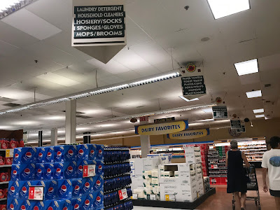
The aisle markers incorporate the pre-2002 logo and are obviously older than the rest of the decor. They've held up pretty well, though.
Frozen foods are in the last few aisles, and here's a look down aisle 20. The cases on the right side are older than the ones on the left.
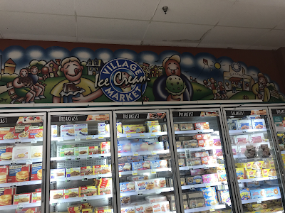
The bakery is next to ice cream, set away from the rest of the service departments like a 90's GIANT.
A look at the busy but pretty organized front end. The store wasn't overly crowded, but almost every register was open.
Here's a closeup of the huge "We're not just a supermarket... we're ShopRite" slogan across the front wall. I find it kind of funny how instead of thanking you for shopping, they're just boasting that they're not just a supermarket... they're ShopRite.
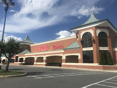
And, before we go, here's a look at the old-school ShopRite logo on the front of the building. I don't know for sure that this is original to the store, but it's pre-2002 at least.
Other Images of Interest
Street View Images
2022
I would guess the last time this store had any exterior changes was when the new script logo was put up, which happened before 2008.
Nearby competition
2.9 miles away: Acme of Vineland
The ShopRite's closest competition is this Acme nearby. While the ShopRite is slightly larger, the Acme is more modern and has a better location (although the ShopRite is easier to enter). We saw this store last week, and you can check it out here. It seems both stores do a good business, as they've coexisted for over 25 years at this point.
Thank you for shopping with The Retail Connection! I was pleasantly surprised by the conditions of this store. While it isn't necessarily modern, it's pretty large, very clean, and the employees are all extremely nice. I spend most weekends near this store, and while I hadn't even known about it until I came here to take pictures, I think I'll start regularly shopping here. I can't speak for all Village stores, but if this one is indicative of the rest, they put on a great show. See you next week! The Retail Connection: Check out happy.


.png)


Sometimes cartoon-ish decor can come off as a bit creepy (see here: https://albertsonsfloridablog.blogspot.com/2016/09/former-albertsons-4486-lake-worth-fl.html) but the decor here has a much more whimsical vibe to it (and those characters aren't going to give me nightmares, like that muffin in the store at that link!) I like this decor, as it's a nice balance of fun and creative (as well as colorful), even if it does look like it's 20 years old in places. The meat signage though looks a bit odd amongst the rest of the decor, and look like an afterthought. Overall though this looks like a nice store!
ReplyDeleteEw, that Western Beef decor is absolutely horrifying! I especially hate the smiling black and white cookie.
DeleteI also noticed that about the meat signage (as well as the "milk-juice" sign). I'm assuming it's part of the decor and not something older or newer, though I do agree that it looks like an afterthought and I wonder why they chose that style. It definitely is a nice store. Thanks for commenting!
These cartoons may not be creepy, but they do remind me of an airbrushed T-shirt I'd buy at a tourist trap in Florida! Regardless, it was interesting to learn about the term "appy" and seen the use of the word "horticulture" for the floral department. I also appreciated the "real" floors used in this store!
ReplyDeleteThose cartoon characters would fit right in on a tourist T-shirt! I was interested to hear about "appy" and "horticulture" too. I wonder if people actually use those terms casually. "Hey, I'm running to the ShopRite to get some lunch meat from the appy!"
DeleteThanks for commenting!
Although Village's owners (the Sumas family) are Greek, they have strong roots in the Jewish community, with their earliest stores in suburbs of Newark, many of which have large Jewish populations. In fact, the ShopRite in Livingston (a community that is 46% Jewish) has a full kosher deli in store. West Orange and Elizabeth also previously had large kosher departments, which have since been downsized. But that is where their use of the appy name comes from!
ReplyDeleteA further note on the history of appy: the appetizing store (or department), in kosher food tradition, is the other half of the deli. In kosher foods, meat and seafood/dairy need to be kept separate, and a delicatessen would sell meat products (like pastrami, brisket, and turkey), and an appetizing store would sell things like cream cheese, other cheeses, and smoked fish like lox, whiting, or sable.
I have always loved this decor because I grew up with it in my Village ShopRite, but I don't know that the cartoony scenes have aged particularly well. As for your interest in the lack of signage in certain departments like dairy, I wouldn't be surprised if there previously was more decor up there that was removed during a reset. Village stores used to be very very cluttered and full of all kinds of junk, but somewhere around 2015 they realized that was a terrible idea and cleaned everything out and removed nonessential decor in a lot of stores. I saw that in a lot of the Village stores near me.
Thanks for profiling this store! I love seeing Village stores that I've never been to... since I know the ones around me so well!
Thanks for the history of the appy! I did know that keeping kosher requires separating meat and dairy, but I didn't connect the dots that that's why appetizing stores sold seafood and dairy.
DeleteI really like the decor as well. The pictures here were from my first time in this store, so I couldn't tell you for sure if that's the reason why the meat and dairy signage is different, but that sounds like a plausible explanation. I found this store to be pretty streamlined and well-kept. The employees were very nice as well. I went back the week after I took these pictures, and my cashier from that trip recognized me and said hi.
Thanks for commenting, and I'm glad you enjoyed this tour! I'd love to see another Village store sometime. I might be able to go to the Rio Grande store later this summer.