4620 Black Horse Pike
Welcome to the Mays Landing Walmart!
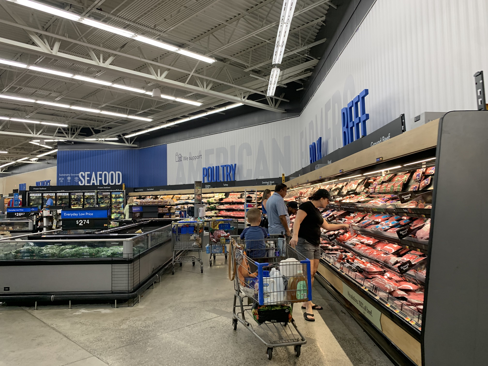
It's our third time in a Walmart here on The Retail Connection, and this one is by far the best! Not only is it a Supercenter with a full grocery section, it's also been remodeled with Walmart's latest decor, known as Airport. This store first opened back on October 22, 1994 as one of the earlier Walmarts in New Jersey, and reopened as an expanded Supercenter on October 26, 2012, just over 18 years later. Let's take a look!
Heading in through the grocery entrance. The grocery department is on the right side of the store, which is where the expansion took place. This area was formerly additional parking.
The first grocery departments we see are produce and meals to go. Airport is probably my favorite Walmart decor to date, and it's looking really good in this store.
The bakery is on the right wall next to the deli, located under an overhang. The right side has two aisles of bread and snack cakes, while the pre-packaged cakes and service counter are on the left side of the alcove.
Frozen foods are in the aisles across from the bakery.
Breakfast meats and dairy occupy the remaining space in the grocery area.
Side note, I really like these lit endcaps. I've been seeing them for different brands of soda a lot recently, mostly at ShopRite.
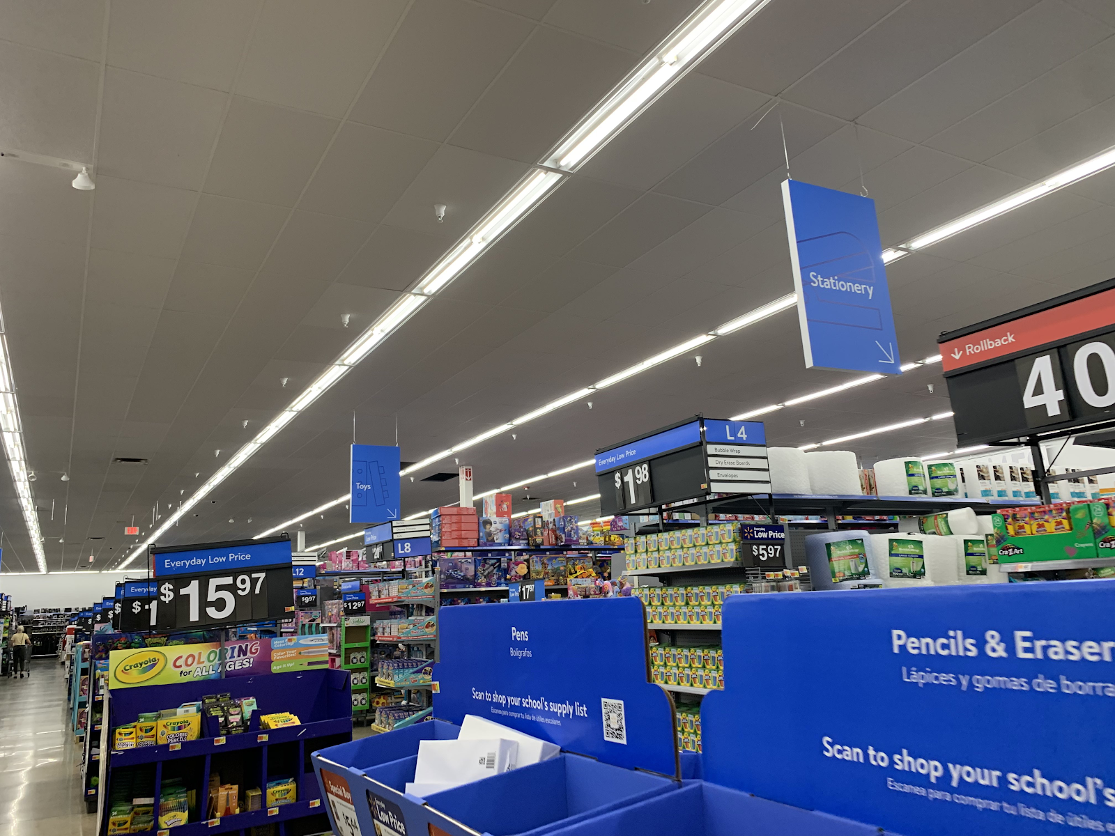
One final look down the aisles towards the front of the store. Now, let's move along to the general merchandise...
Pharmacy and HABA are along the front wall. The garden center is on the left side of the store just past this area.
The vision center, customer service, and checkouts are in the front. This store only has four manned checkouts left, with the rest being replaced with Scan & Go and self-checkout.
2023
Due to the hidden location of this store, there unfortunately aren't many good Street View images.
Nearby competition
0.4 miles away: Acme of Mays Landing
3.2 miles away: ShopRite of English Creek
We saw this store in the Egg Harbor Township Lidl post. This store is owned by Village Super Markets and is still pretty much all 80's on the inside.
That's all for this post! This was my first time in a Walmart Supercenter in a while, and also my first time experiencing the Airport decor in person. It's definitely a step up from the Project Impact and Cyanominimalist packages, and I hope to see it spread to more stores. Anyway, thank you for reading! See you next Friday when we're back in PA! The Retail Connection: Save money. Live better.


.jpg)


I'm a fan of the new Airport decor as well - it actually looks like Walmart put effort into this decor to give it a little more substance than some thin plastic signs hanging in front of the wall. I like the 3D lettering and shadow effects from the signing, which add depth to the new look. The aisle markers with the pictograms are a nice touch too, and I like how some of the signs have Easter eggs in them with the Walmart spark logo sneaking in (like the "Audio" sign in the photo after your last one of the grocery department). I have to give Walmart some credit for the effort on the new decor, and trying to make their stores look better and less soulless.
ReplyDeleteI agree. The Project Impact decors weren't terrible, but they were definitely void of anything interesting. This new decor looks really sharp and is probably the best Walmart has ever had.
DeleteAlso, I didn't even notice the spark in the Audio sign - that's really cool!
The hidden sparks were common throughout the BD2.0 era -- glad to see some of them continuing here!
DeleteI'm pretty sure that area where the Philly Pretzel Factory is was really where the Vision Center originally ended and Pharmacy began. Typically with these pylon-era stores, the restaurant space was located next to the entrance, right after the service desk. Before this store was expanded to Supercenter, it had a unique variation of the 1990s paint job in which the grey part was beige instead.
ReplyDeleteThat said, the floors still look awful as bare concrete compared to tile. The Airport decor still does not save the interior from being soulless if they are still hacking up the floor as standard procedure.
I'm not entirely sure I understand what you mean about the Philly Pretzel Factory space. If I'm not mistaken, that entrance was always there and was originally the main one, so it would've made sense for McDonald's to go there.
DeleteI do agree about the floors, though.
Seeing the pictures of this store during the expansion process, the new left entrance was to the left of the original entrance, and given this store was built with a Vision Center, that Pretzel Factory space would have originally been part of the original Vision Center. These stores back when they were non-super would have had the service desk and restuarant space (originally Radio Grill) just beyond the entrance. That's why I implied McDonald's was originally there before the conversion to Supercenter. Those 1990s non-super Walmarts did not have restaurant spaces anywhere else in the building.
DeleteOh, okay, I see. I didn't realize you had photos of this store during the expansion and I thought you were just making an assumption.
DeleteGreat photos! I really like this package as well. It's a good look for Walmart.
ReplyDeleteIt's interesting to see how the grocery department aisle markers are still the full 3D "pallet style," while the hanging department signs in the rest of the store are only one panel as opposed to two. I feel like I've seen pictures from other stores where all signage has gone just to one panel, and has eliminated the directional arrow in the bottom corners, too. Perhaps this store was just a transition to that, or the low ceilings in the GM areas have something to do with it? I'm not as upset at the single panel signs (even though I think the pallet style looks better, I can understand it being cheaper to go single), but I am disappointed by the removal of the arrows...
I have just found out that the Hernando store is about to remodel, so I'm curious to see what types of signage it will get. I will miss Black Décor 2.0 in that store. I haven't gotten to see that package in quite some time as the stores I shop at now in Ridgeland, Madison, and Canton all still have Impact. I am so ready for a change in décor.
Thank you!
DeleteI didn't notice that about the aisle markers, but it's certainly interesting. All I know about this remodel is that it took place between two and four years ago, so I don't know if this could be a transitional store.
The two Walmarts I shop at most often, Millville and Eddystone (both seen on the blog before) have Black Decor 2.2 and Project Impact 4.0, respectively. I definitely prefer the Impact era to the Black Decor, although Airport tops both of them. I've also always been fond of their Red Decor from the 90's, although I doubt that still exists anywhere.
You're welcome! Man, I can't believe Airport has already been around that long. Time flies.
DeleteIt's tough for me to say which I prefer out of Impact and BD2.0. What I can say with certainty, however, is that I really only best prefer the original versions of both packages -- Impact certainly went way downhill when it got cheaper and cheaper, and I can't say I'm a huge fan of the font and color swaps in the various later iterations of BD2.0, either. I'd be surprised if the Red Décor is still around anywhere, but you never know!
I was surprised that Airport is already that old, too! It still feels really new.
DeleteI definitely agree that both Impact and BD got progressively worse as the "updates" came along. I like how Impact remained colorful, though.
I first thought you were crazy when you said this store was expanded into a Supercenter based on the façade, but the low ceilings over general merchandise quickly proved my theory wrong. It still throws me off when I walk into one of these expanded stores because I've become so accustomed to purpose-built Supercenters (when I actually do step foot into a Walmart, that is).
ReplyDeleteLike many of the others have said, I also agree that this is probably my favorite Walmart package—I just wish Walmart could have used some nice vinyl tiles to cover up the scarred concrete floors. I've also been surprised at how many stores I come across that have remodeled to this package compared to what others seem to see. Regardless, nice tour!
I may be crazy in other ways, lol, but yes, this really is an expanded Supercenter! It does feel a little strange compared to a regular Supercenter inside, although we don't have a lot of those around here either.
DeleteThe flooring is definitely the main negative part of this store, although I suppose it matches better with the blue and white of this decor than the more colorful Project Impact look it replaced.
Thank you!