1502 West Chester Pike
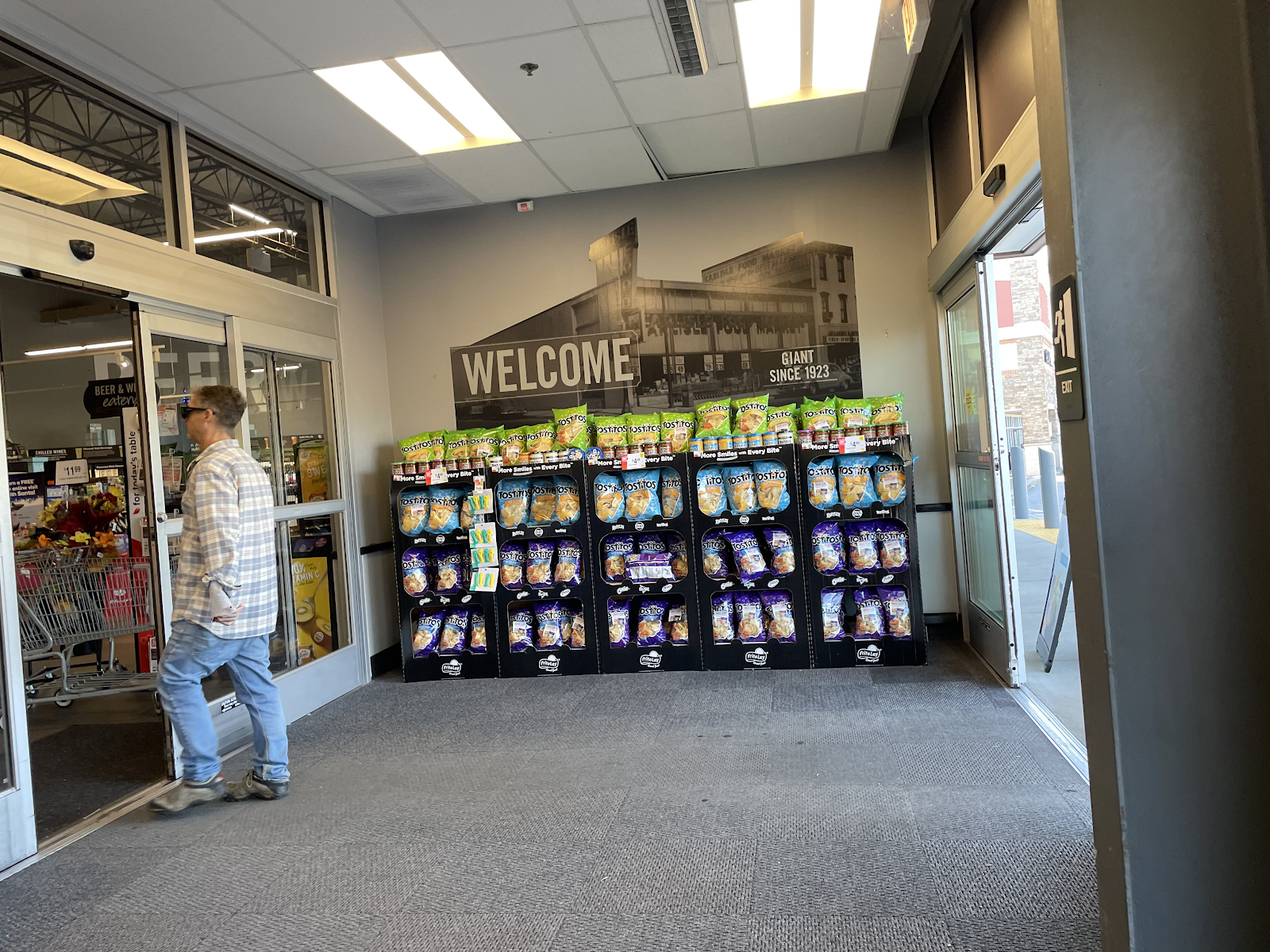
Welcome to the Westtown GIANT!
We have crossed the border into Chester County and are touring one of their many GIANT stores! However, there wasn't always a GIANT here. Marketplace at Westtown opened in 1979 with a planned anchor of A&P. However, the store didn't open until 1982, by which point A&P's Philadelphia division had been renamed SuperFresh. The store lasted until 2001, then was briefly vacant until Clemens opened in 2003. The store was sold to GIANT in 2006. GIANT closed on January 6, 2017 and demolished the building in short order, with this brand new location opening on November 10. Let's look around!
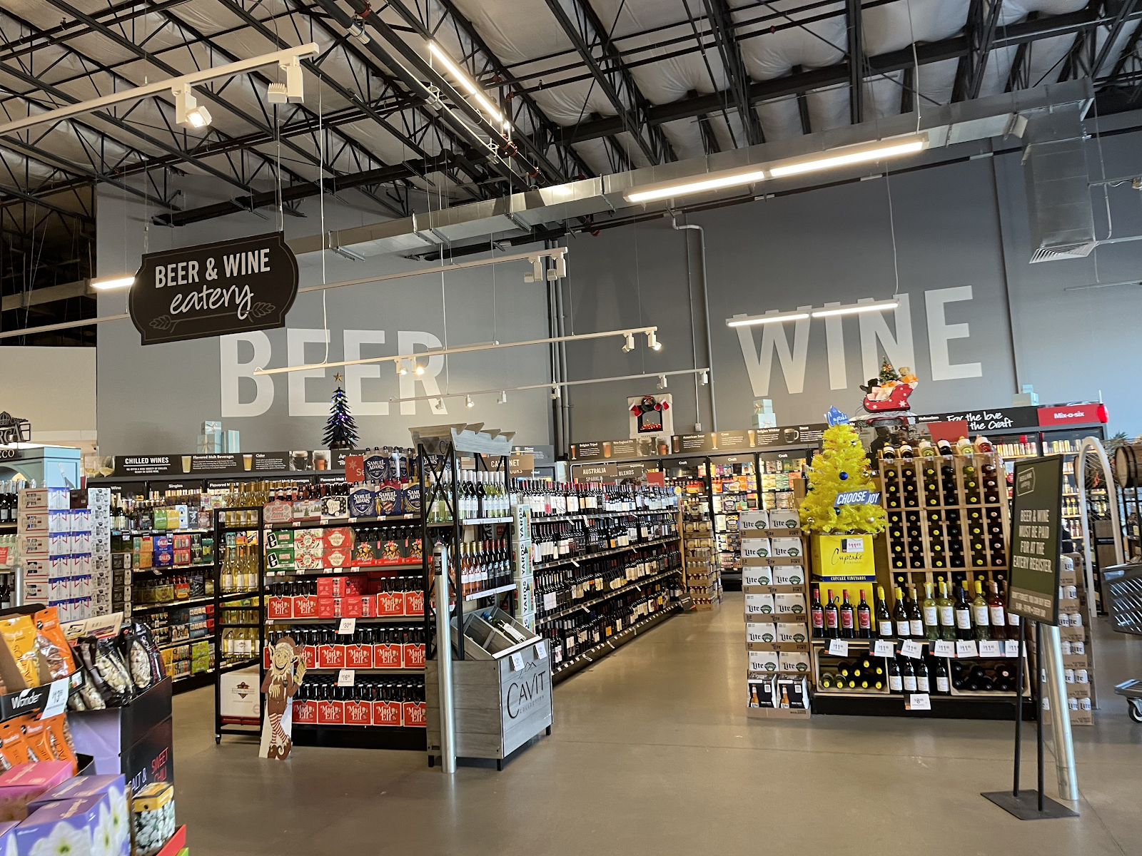
Upon entering, beer and wine is to the right and produce is straight ahead. Right off the bat, I was not a fan of the dark ceiling. It made the store a lot less inviting than it would be with a lighter ceiling.
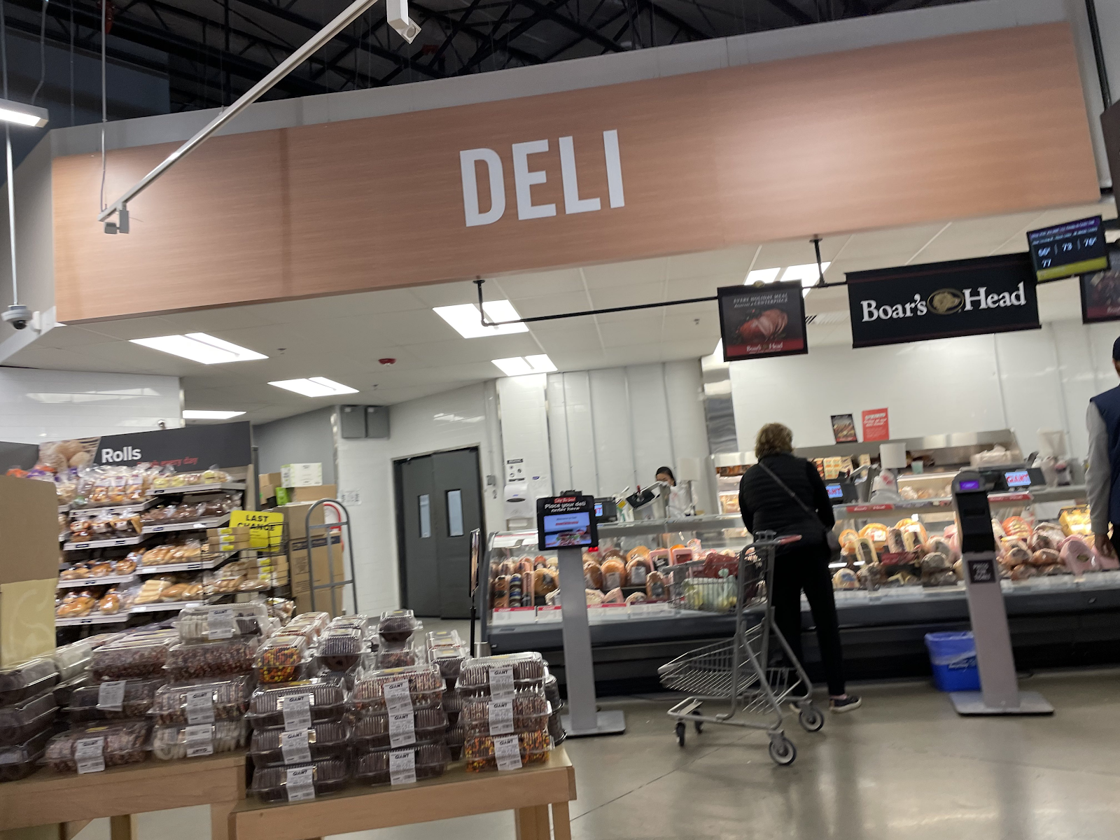
The fresh kitchen and deli are on the right wall, with the bakery being the first department in the back of the store. The decor here is certainly not ugly, but it's very bland.
Meat and seafood are located next to the bakery. Having recipes on the wall is a cool touch, but as PlazaACME noted, there's no explanation as to how you're actually supposed to prepare it, so it's not very helpful.
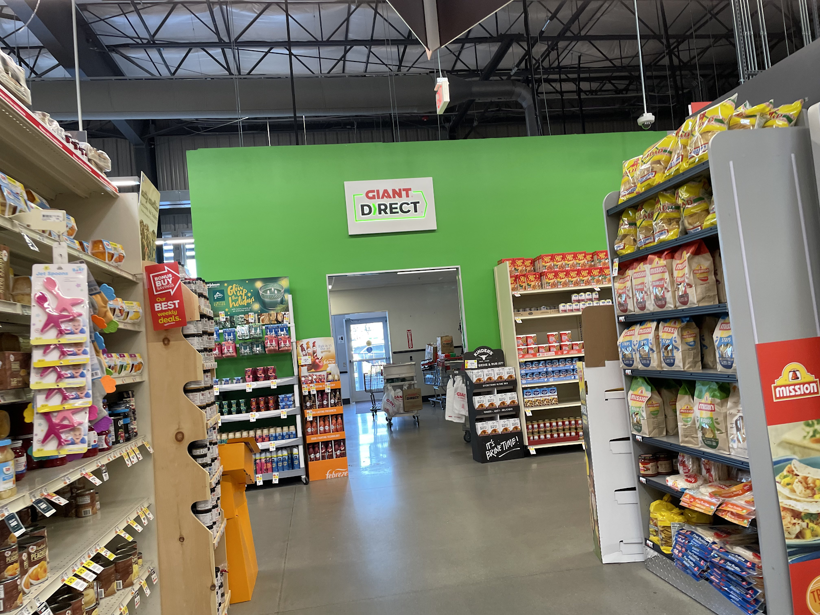
Jumping to the front end for a moment for a look down aisle 2, full of chips and other snacks. I believe this is also our first time seeing Marty, the robotic assistant at GIANT and Stop & Shop. I don't know if they have him at Martin's, but since they share a name I would hope so!
Milk is in the back left corner and the rest of dairy is in the last aisle. I think the dairy department is the best-looking area in the store, which usually isn't the case.
The GIANT Direct zone, checkouts, and customer service can be found along the front end. I found the "Proudly Serving Westtown Since 2017" signage interesting, since while this store did technically open in 2017, they've been in this spot since 2006.
Other Images of Interest
The previous Westtown GIANT
Photo courtesy of PlazaACME
PlazaACME has a lot of great photos of the original store on Flickr. GIANT retained the Clemens decor until this building's very end.
Street View Images
2023
2007
Here's the old store, with its unique Clemens-meets-A&P facade. The footprint of the current GIANT also includes a former Rite Aid. The Rite Aid relocated across the street shortly before GIANT was demolished.
Nearby competition
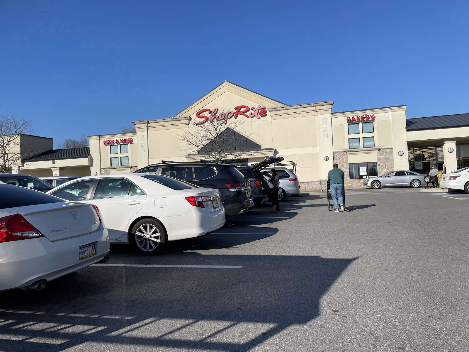
2.8 miles away: ShopRite of West Chester
ShopRite stores aren't very common in this neck of the woods, but West Chester has one! This store is quite old, too, dating back to the 1960s. We will be touring this location next Friday.
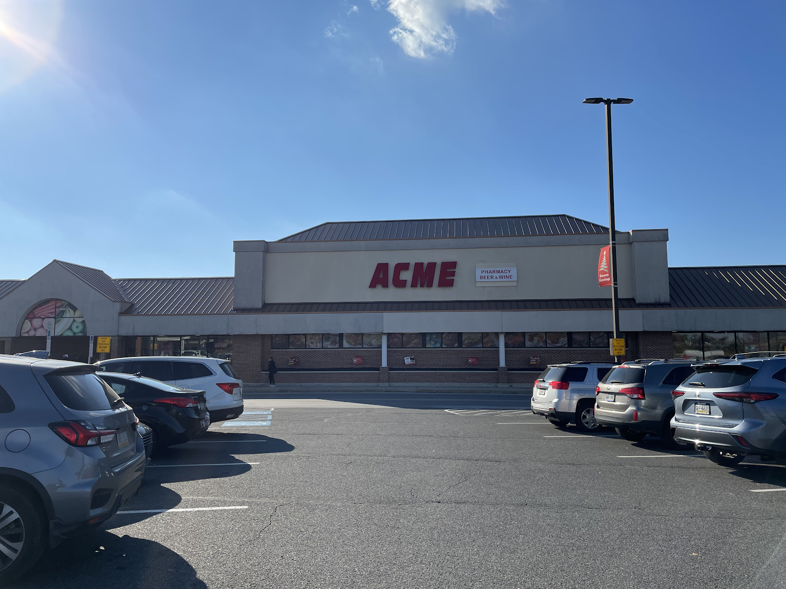
3.5 miles away: Acme of West Goshen
We started this adventure with the Acme in Newtown Square, and we're ending it with the Acme in West Goshen! This store is also pretty old, having first opened in 1958. It received a major expansion in the 80s, and currently has the Quality Built decor inside.
That is going to do it for our tour of this GIANT! While I'm sure it's a pretty nice store for the average shopper, I was not impressed by this location, with the dark atmosphere and bland decor. I thought the Newtown Square store was much more inviting. Anyway, we'll be headed into West Chester next week to see two more stores. Have a great weekend, and Merry Christmas to all who celebrate! The Retail Connection: For today's table.










The building here now pales in comparison to what was here prior, but thankfully Giant's decor has improved these days from the somewhat boring version of the gray look this store received.
ReplyDeleteAnd have a Merry Christmas!
I agree. While the new store isn't horrible, it was definitely better before. And yes, their new decors are miles better. The late 2010s was probably their lowest point in terms of design, and this is by far their worst decor ever.
DeleteThanks for commenting and Merry Christmas!
I don't have to wonder what Anonymous in Houston would say because even I think this store is pitiful! It looks like Giant decided to build a basic warehouse and put gondola shelves with food up inside. The unpainted ceiling insulation looks really bad with how it contrasts to the painted trusses and reminds me of the Safeway NW Retail has posted about recently. Add on top of that the bare concrete floors (which are at least not cracked/scarred since they are new) and the minimal décor to have quite the depressing environment. I feel like a Walmart has more personality!
ReplyDeleteAll great points here! It's a shame the coolest store in the chain was replaced by the ugliest. A lot of times, the stores we find to be unappealing are usually considered "nice" by regular shoppers, but I don't think even this store looks good to the average person. I remember reading a review about a GIANT that said while they like the products and service, they don't shop there because the store is too gray - and this store is far worse than that one was!
DeleteThankfully, the only other store that was built like this was Brookhaven (which we'll be touring in March) but even that one isn't as bad. I really hope they remodel this store soon, since the new decor (seen in Newtown Square) is a lot better.
Agree with all of the above comments that this new store is rather a downgrade over the previous Clemens facade and interior. I'm sure it's nicely built, but just very bland and dark for my tastes... Still glad you got to document the "after" to the better "before," though.
ReplyDeleteMerry Christmas!
It is a nice store in some ways, but the darkness and blandness definitely make it fall flat. And yes, I'm glad I got to document the after to the better before, since hopefully the store will soon be redone and the current after will be the before!
DeleteMerry Christmas!
Its like Ahold couldn't be bothered trying to actually put some decent decor in this store. Even some food related pictures like the couple they have the dairy section would help out in the other departments. This decor looks much better in standard drop ceiling stores. Ahold has been using this decor in Giant-MD stores that retain their pre-Ahold layouts. These are all drop ceiling stores. Without the vast empty space between the top of the sign and the roof, the decor doesn't feel as cold. The majority of the new build/relocation Giant-MD stores don't use this decor. They use a decor with signs that have a subway tile background for the service departments.
ReplyDeleteI agree that this decor package looks much better in stores that don't have so much empty wall space, but even then it's still not great. The current Giant-MD decor is much better than this, and I like the illuminated photos on the walls, but it's still pretty bland in my opinion.
Delete