3590 West Chester Pike
Welcome to the Newtown Square Acme!
We'll be spending the rest of the year in Pennsylvania, so get comfortable! In today's installment of The Retail Connection, we will be touring the Acme of Newtown Square. This store, one of Acme's earliest pitched-roof models, came roaring into the township of Newtown on June 25, 1958, as a relocation from a 1951 store across the street. It's been expanded and remodeled several times since then, and is one of the chain's top-performing stores. It recently got this facade upgrade as part of a remodel of the center, and inside has the Quality Built decor. Let's take a look around!
At the last Acme we toured, the foyer was stocked with lots of Halloween goodies. Christmas has taken over in Newtown Square!
The left entrance goes directly into the small produce department. The original pitched-roof section of this store ends on the other side of this alcove, so the entire grand aisle is an addition.
Foods to go and the corner deli line the left wall. This store previously had the Chalkboard Market decor, so the space for signage is quite limited (the deli would have originally looked more like this).
The deli pantry now just has signage for "This Is Your ACME", interestingly without the fisheye logo.
The bakery is behind produce. I've been to a lot of Acmes, and I've never seen one that has the bakery in this spot. I guess when you take a 1958 grocery store and expand it to the size of one today, the layout will be strange.
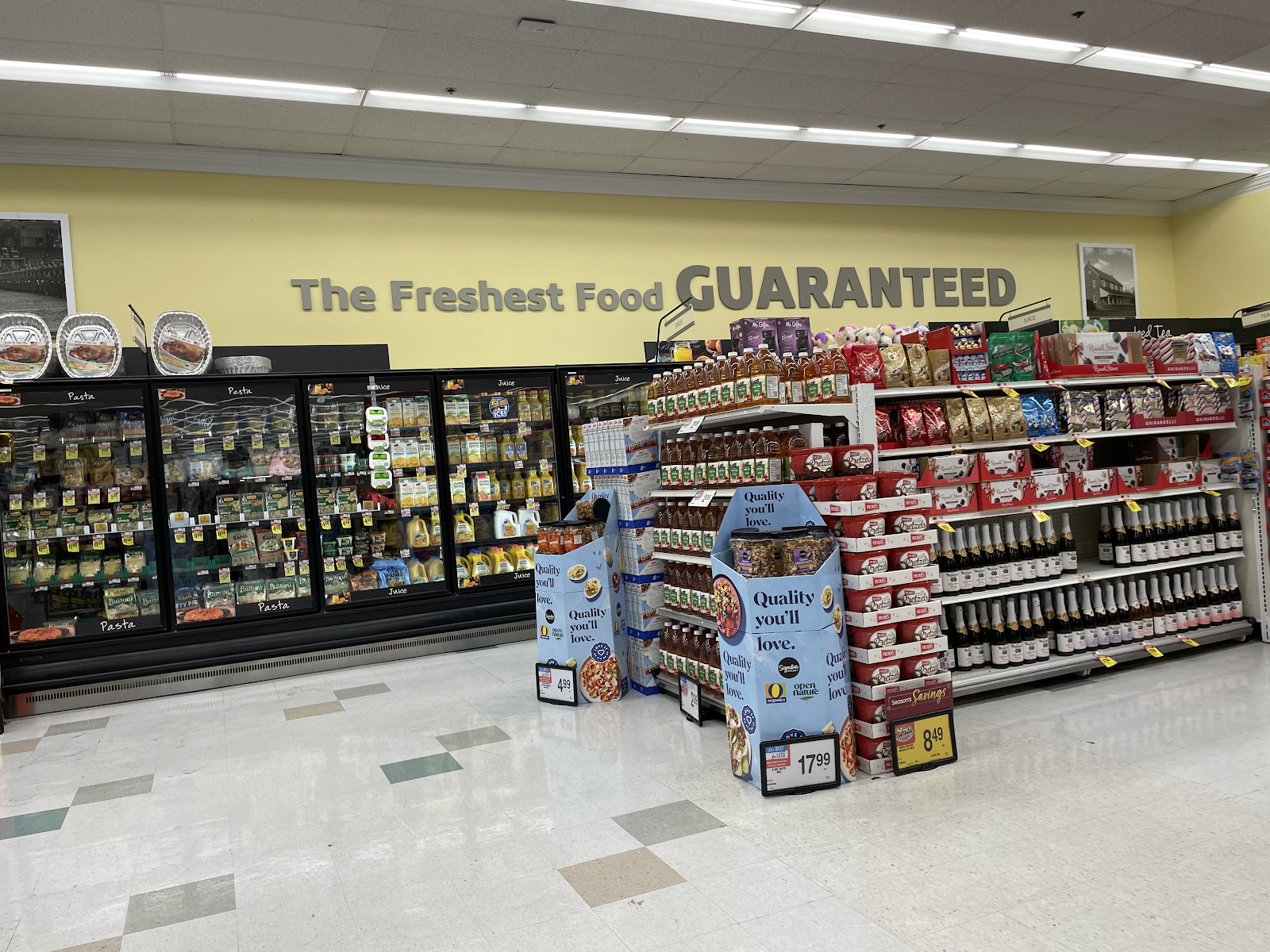
The Frosted Mug is in the first aisle behind produce and bakery. This was previously the coffee and cereal aisle. The patterned tiles are left over from the Chalkboard Market decor.
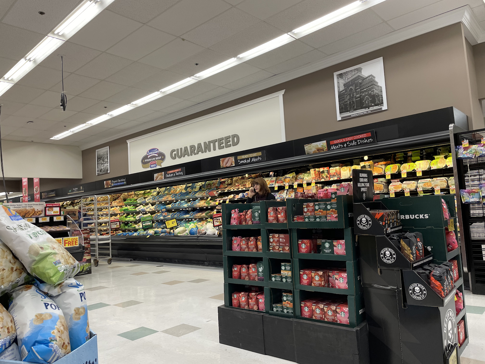
Meat and seafood run down the back wall of the store. The signage for Lancaster Meats in the first photo is really off-center.
This was my first time seeing the new circular Signature Select logo on products. It was first launched in May. This was the original design. The new one is definitely a lot more modern and sharp.
Dairy is in the back right corner and the last full aisle of the store.
Health and beauty and floral are on the right side of the store. The HABA alcove was previously a state-run Wine & Spirits Shoppe. This store doesn't have a pharmacy, but there was previously one in the center a few doors down for many years.
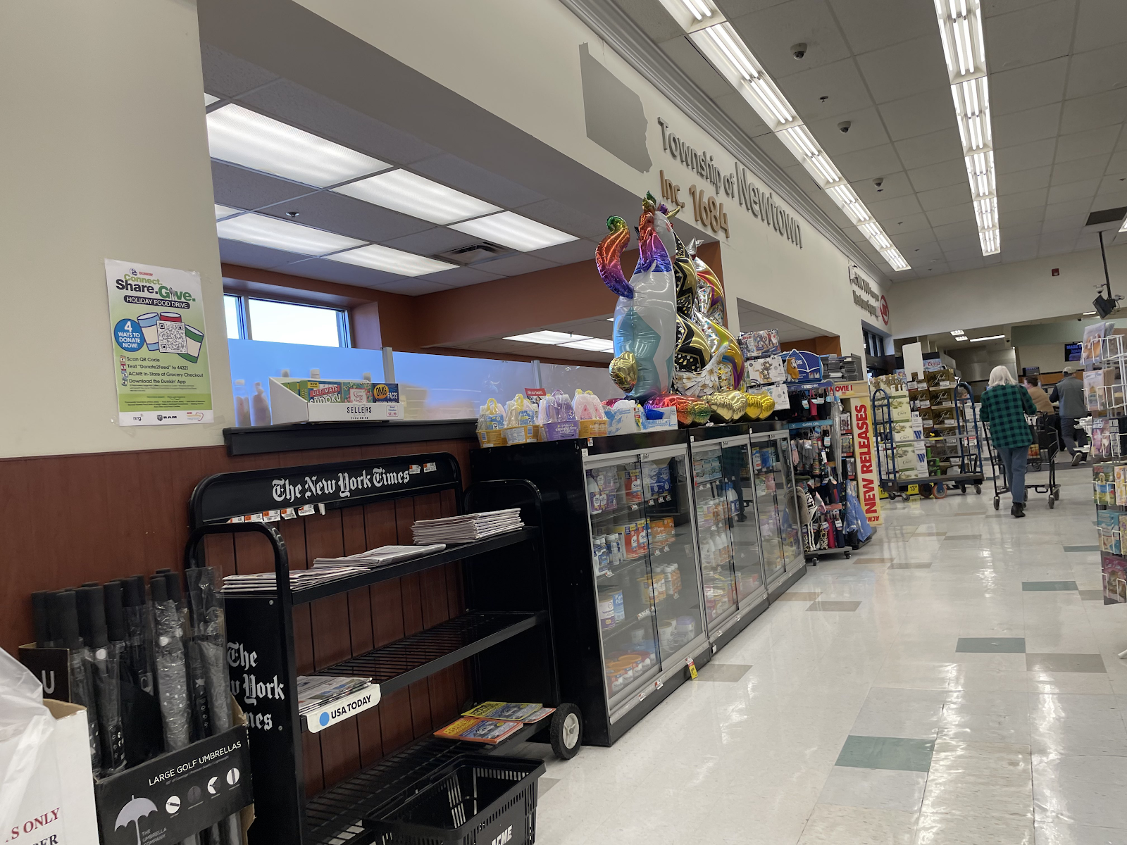
Checkouts and customer service round out this store. This was probably one of the last Quality Built stores to get the township signage.
Other Images of Interest
Street View Images
2018
The new facade isn't much different from the previous 90s one, but it's still a nice upgrade.
Nearby competition
0.7 miles away: Whole Foods of Newtown Square
This store opened in January 2019 as part of a new shopping center. The next store on the nearby competition list is also owned by Amazon...
1.6 miles away: Amazon Fresh of Broomall
The Broomall Amazon Fresh opened in September 2022 in a former GIANT. It was the second Amazon Fresh in Pennsylvania after Warrington. We toured the Broomall store back in March, and you can look back on it here.
2.8 miles away: GIANT of Newtown Square
The Newtown Square GIANT opened in 2013 in a former Genuardi's. This store is the next stop in Newtown Square, and we'll be learning more about it and touring it next week!
That concludes this post! While this Acme had a very odd layout, it was a nice and clean store and is still in good shape considering it turned 65 this year. It was also quite busy the day I was there, so it's not surprising it's lasted as long as it has. Our time in this area is only just beginning, and next week we'll be seeing the GIANT in town. Until then, though, thank you for reading and have a great week! Sincerely, The Retail Connection.


Expanded supermarkets are usually full of oddities. Being 65 years old, I wouldn't be surprised if this store was expanded more than once too, and multiple expansions just make things even more strange. Even if the layout is a bit odd, Acme did a good job of hiding the fact the store was expanded, as the interior and exterior all look cohesive without any weird architectural transitions.
ReplyDeleteI know I said it on Discord, but I'll say again that the upgraded facade from the recent remodel looks really good!
There have definitely been many expansions of this store! I believe the major ones were in the late 70's and mid 90's. While we can tell it's a hodgepodged store, it actually does flow pretty well.
DeleteI agree that the new facade is great! The logo itself seems strangely off, though. Thanks for commenting!
I'll echo AFB's points about the facade design and the interior not looking too obviously expanded!
ReplyDelete