2291 N. 2nd Street
Welcome to the Millville Walmart!
Thanks for shopping with The Retail Connection again! This post won't be as much of a tour as it will be a showcase of the décor. This Walmart in Millville has the Black Décor 2.2 remodel inside, which you can probably already ascertain from the blue and gray exterior. Like the Eddystone Walmart we've visited in the past, this store isn't a Supercenter. That is likely due to the fact that there was a Pathmark at the other end of the center when this Walmart opened in 1995. Even though the Pathmark closed in 2010 and is now Hobby Lobby, this Walmart still only has a pantry section with no service grocery departments. Without any further adieu, let's begin this very quick tour!
Here, we're looking past the customer and money services area towards the restrooms and the crafts department.
Greeting cards, party supplies, and anything else you might "Celebrate!" with are in this department along the right wall.
A look down one of the action ways towards the pharmacy department at the front of the store. The Black Décor has a lot of different types of signage, and we can see three in this shot.
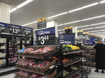
Here we're in the grocery department on the left side of the store. This area is long but narrow, so the produce and baked goods displays that separate the aisles make them slightly cramped.
The pharmacy and HABA section is in the front, just ahead of the checkout lanes. The Bogle font is used on the department signage on this store, showing that it was remodeled after 2018 (earlier implementations use the font Myriad).
A look at the checkouts and the Walmart Vision Center. This store only has four standard checkout lanes, but a lot more Scan & Go self-checkouts.
A closer look at the "Save money. Live better." signage hanging on the front wall and seen as you leave the store. Plus, a peek at a New Jersey Lottery vending machine.
Other Images of Interest
Street View Images
2019
This was probably not long after the remodel.
2018
The store was still using the brown and tan exterior paint scheme at this time. I believe the interior décor was the second version of Project Impact. The store was remodeled in late 2009.
That's going to do it for this very short Walmart tour! Since the last Walmart we saw still has the Project Impact 4.0 interior, I figured I'd showcase a later décor as well. Have an awesome weekend, and be sure to stay tuned for some new supermarket tours in the weeks to come! Thanks for shopping The Retail Connection: Save money, live better.


This is what I like to call the "impactb" layout - which has the Crafts and Celebration departments in part of the apparel section, electronics in the back left/right corner (depending on where the entrance is placed), jewelry in the middle apparel actionway, and the extended pantry section being next to the garden center (much like how Target stores place their pantry sections). Kind of resembles the Pittsfield, Massachusetts store in being a Vision Center pylon store and with that interior layout.
ReplyDelete