26370 Bay Farm Road
Welcome to the Millsboro Harris Teeter!
Last week, we toured a one-word store in a two-word town. This week, we're touring a two-word store in a one-word town! The Harris Teeter in Millsboro opened in May 2008 as the second Delaware location of the chain. The store is unchanged inside and out from when it first opened, so let's take a look!
We enter to the right into the Farmers Market department, with produce and packaged fruits and melons. I really love the murals seen throughout the various departments, including here in produce.
Deli and bakery encompass the Fresh Foods Market on the right side of the store. A photo of this area from shortly after the store first opened can be seen here.
Bread, international cheeses, and floral are across from the main service departments on the right side of the store.
Packaged meats are up next on the back wall. The meat department, known as Harris Teeter Rancher, was the first to be renamed in 2002 during Harris Teeter's attempt to provide a more unique shopping experience with special branded departments.
While Harris Teeter does carry some brands from its parent company Kroger, their house brand is still Harris Teeter and even comes from their warehouses. I'm assuming this is because Kroger wants to differentiate Harris Teeter from themselves as they operate in some of the same areas.
Dairy takes up the rest of the back wall. I love the milk signage. While Harris Teeter's new decor looks nice, too, it definitely lacks the character this look has.
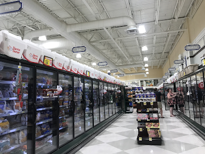
Frozen foods and a ton of Harris Teeter-branded coolers are in the last aisle. I wonder how old that ice cream photo is.
Health and beauty aids are located in the front half of some of the aisles on the left side of the store. This location does not have a pharmacy.
Books and magazines are in their own designated alcove on the front wall across from health and beauty.
There was this fenced-in area just past the entrance/exit, which I'm assuming used to be a coffee shop judging by the signage but is now empty space.
Other Images of Interest
Street View Images
2015
Only one Street View picture for this store, which shows that it's had essentially zero remodeling since opening.
Nearby competition
0.7 miles away: Giant of Millsboro
Up the street is the Millsboro Giant, which opened back in the mid 2000's. This is a pretty standard Ahold-era Giant, and looks just like a Stop & Shop from the time.
1 mile away: Weis of Millsboro
The Millsboro Weis is exactly one mile away from Harris Teeter. This store was one of four former Food Lions in Delaware to be acquired by Weis in 2016 during the Ahold-Delhaize merger. I took this picture last summer, but the store looks the same today.
That's all for today's post. What did you think of this Harris Teeter? This store really felt like a ShopRite to me for some reason. It was definitely a nice store though. I'm also glad to be able to present a Harris Teeter, or even a Kroger-owned store in general, to the blog, considering there are not many in this area. Remember to check out my Flickr to see all the retail I saw during my time in Delaware. Next week, we're headed back to New Jersey to tour an Acme. See you then! Thank you for shopping The Retail Connection: In Food with Love.


Awesome work! What I will note is that the cafe design is present at several other Harris Teeters which have never had Starbucks, so it's likely always been that way. It's also one of my favorite retail decor packages in all.
ReplyDeleteThank you! I wasn't sure if there was ever self-service coffee or seating or anything like that in the area before, since it seemed strange that it was just totally empty. It's one of my favorite decors, too, although I also like their newer decor.
DeleteHT has always done a superb job with decors. I sincerely hope they don't become a Kroger clone, as decent as Kroger's decors are.
DeleteDefinitely! Yeah, Kroger's are nice, too, but Harris Teeter is way ahead.
DeleteDefinitely agree with you that this package is better than their more recent one.
ReplyDeleteWhile I do like the current one, particularly because it's not too simplistic but also not too over-the-top (looking at you, Weis...), this one definitely has a certain charm to it that the other one lacks.
Delete