4930 Edgmont Ave
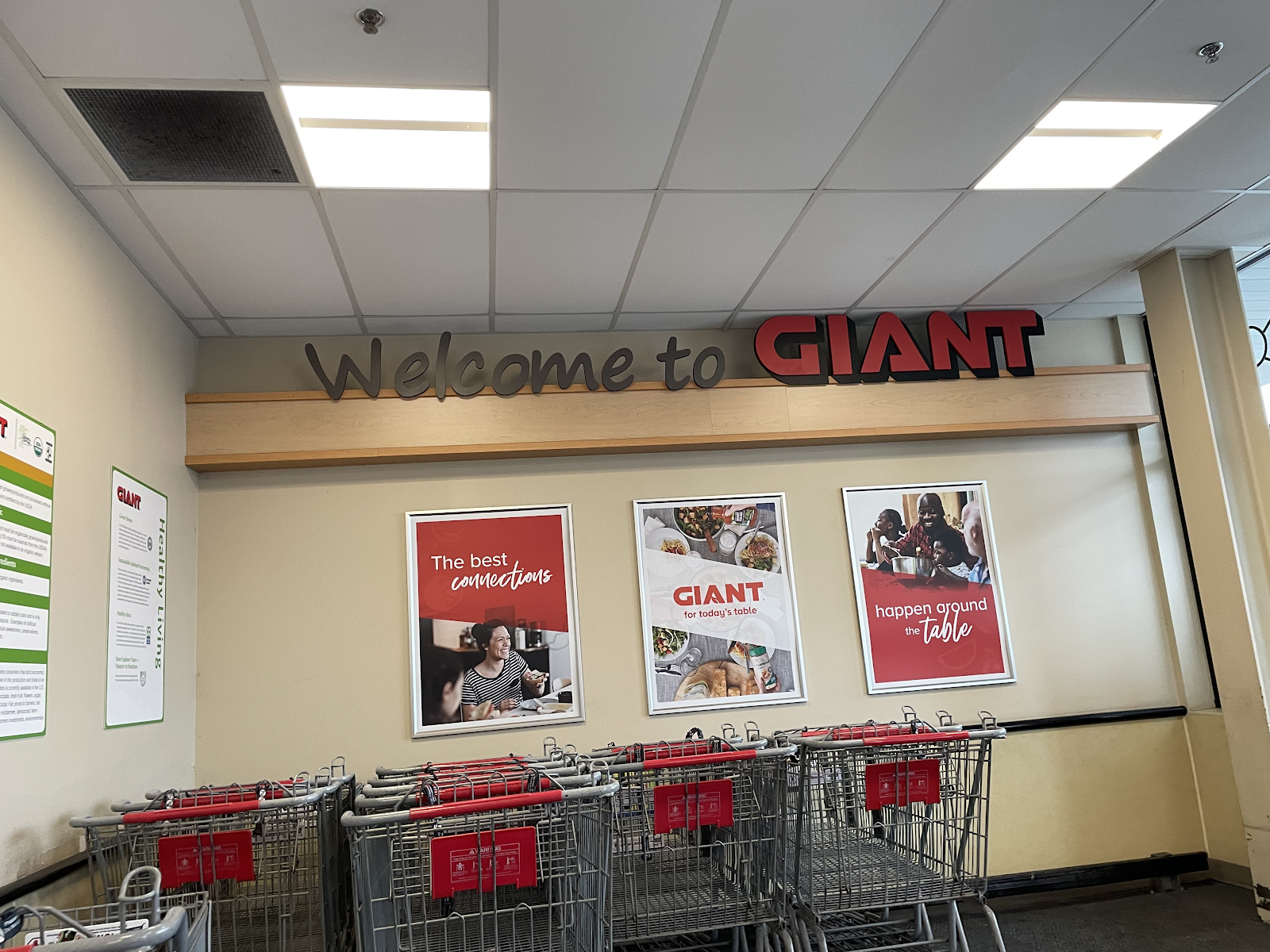
Welcome to the Brookhaven GIANT!
We're marching into a new month with a store with decor that's marching out of existence fast. This GIANT opened on November 11, 2016 as a replacement location for the original Brookhaven GIANT across the street, which opened in 1987 as one of the earliest in the area. It's also a notable store for being the very last GIANT to open with the two tower entrances, before they switched to the design we saw in Westtown. Let's get some shelter from the rain and go inside!
Only 12 other GIANT and Martin's stores still have the decor we'll be seeing today. I know Stop & Shop had their own version with the fruit bowl added, but I don't know how many of those stores still operate.
Upon entering, the beer and wine section is to the left and produce is to the right. This store had a somewhat dark atmosphere like Westtown, built around the same time, but it worked better in this store since the wall decor actually has color.
Prepared foods are on the left wall, with the deli in the corner. The exposed ceiling above the counters is not pretty.
The bakery, located on the back wall, completes the grand aisle of the store. This store opened around the time GIANT officially moved the bakery to be with the other service departments after years of having it in the corner on the opposite side of the store.
The meat and seafood counter and packaged meats cover most of the store's rear wall, with the signage above the meat cases being from the inferior decor that followed this one.
A look down the famed aisle 12, which in this store is home to health and beauty products. This store got a cheap version of the "Relax. Renew. Revive." signage. See the regular one in the since-remodeled Exton store here.
The last few aisles are home to frozen foods and dairy.
GIANT Direct and the pharmacy are on the right side of the store, just past the entrance on this side. This must be one of the earliest GIANT Direct departments, as the service was launched in 2019 and the logo seen here was phased out in 2020.
Time to check out of this store. The line for the self-checkouts was insanely long, and Marty wasn't helping by zipping up and down the front end.
Other Images of Interest
Street View Images
2018
I'm not sure when the Citizens Bank was in operation. It closed sometime before last year, but was added after the store itself opened.
2011
The old store, located across the street. Back then, the site of the current GIANT was just woods and a baseball field.
Nearby competition
0.3 miles away: Aldi of Brookhaven
The left half of the former GIANT became an Aldi in June 2018. The other half is pictured vacant, though it was announced that PJ Whelihan's will be taking over the space.
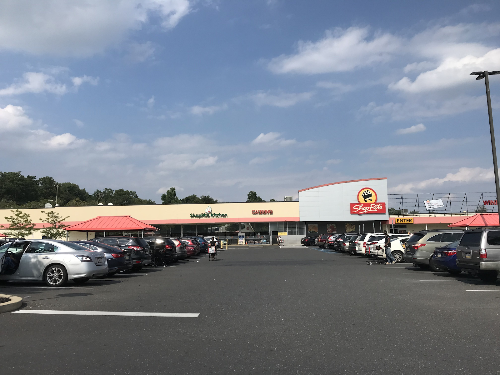
0.5 miles away: ShopRite of Brookhaven
This store opened as a Pathmark in 1971 and closed with the chain in 2015. ShopRite took over the space and reopened in summer 2016. You can tour the store as it was in August by clicking here. Since then, Elwyn Pharmacy has opened in the store in part of the beer and wine department, marking the return of a pharmacy to the building after Pathmark's closed.
1 mile away: Save A Lot of Brookhaven
This store opened back in the early 2000s in a building that dates back to the 50s when it was a Food Fair. You can see the store in April here.
This is a very nice store, and I'm glad I was able to visit it, especially considering it will probably be remodeled soon. For now, though, I'm happy to enjoy it for what it is. Thank you for reading, and see you next week when the city of Philadelphia itself makes its debut on the blog! The Retail Connection: For today's table.


The decor in this store is ugly. The decor is too small for the scale of the store and it gets lost in the sea of wall space because of the high ceilings. Ahold looks like it is getting super cheap as they remodel these stores. When Giant-PA was building their original dual entrance stores they had big, colorful and fun looking wall graphics that made the stores not feel so huge. What I see in this store just makes it look cavernous. This decor would look much better on a store with low, drop ceilings.
ReplyDeleteI agree with all these points. While the store itself is quite nice, it has one of the ugliest implementations of this decor I have ever seen. Westtown, though, is far and away the worst-looking GIANT of all time.
DeleteThe Fun House decor GIANT was using in these stores back in the 2000s was certainly a step up, and to be honest I think it would still look good today. Their current decor that's going into stores now is probably their best one since that era, so hopefully they're going back in the right direction.
Thanks for commenting!
I had no idea this décor was down to so few stores -- that's crazy. While I agree it doesn't look the best in this location, other pictures I've seen of the package looked good, especially compared to the subsequent décor. And like you mentioned, it's kind of odd to see a couple of signs from that later package supplementing the existing décor in this store, too.
ReplyDeleteIt's definitely crazy! I believe the Fun House decor from the 2000s which preceded this look is in more stores, shockingly enough. The weirdest fact relating to that decor, though, is that it's used in a Grand Union! One of the former Tops they acquired in Cortland, NY has that decor.
DeleteI do think this decor looked good in other stores, but it's definitely not great in this one. It's certainly still better than what followed it, though.