Sunday, April 30, 2023

Acme | Avalon, NJ


15 Avalon Blvd.

Welcome to the Avalon Acme!

Today, The Retail Connection is down the shore to take a tour of the Avalon Acme! This store opened in the mid-2000's as the only supermarket in Avalon. It was the planned anchor to a shopping center, although the Acme is the only store that ever materialized. This Acme is very special for its interior décor, which we'll see in just a moment. Let's get this tour going!


Frozen foods for the deli and bakery are in the front of this store, when you first walk in. 


If you didn't already notice, this store maintains the Santa Fe (or "Albertsons Marketplace", as Acme Style coined it) interior décor it opened with! In the 2000's, this was probably the most common look for Acme stores, but as of now only a few implementations of it remain.


The oven fresh bakery is just past the deli. There is a service bakery, but it's being blocked by a produce display in this photo.


I found this produce aisle marker kind of interesting. It doesn't actually list any products, instead promoting the various departments in this store (including the photo center, which does not exist anymore).


This store has a pretty decently-sized produce department. Jersey Shore Acmes usually have beach items scattered throughout the store, like how you see chairs atop the shelves here.


Seafood and meats is in the back left corner. This department was usually configured as "Meats & Seafood", so I'm not sure why it's the other way around here. Most of the S in Meats has fallen off.


Lancaster Meats follow. Lancaster has been Acme's house brand for packaged meat products for many years.


And just past that, we find fresh, wholesome dairy. Also in view are public restrooms and boogie boards.


A look down aisle 8, with paper products and other general merchandise. This store still has its original Albertsons Marketplace aisle markers; many stores got PF&H aisle markers, even if they didn't get a full remodel.


Frozen foods in aisle 11.


Dairy and frozen share aisle 12, the last aisle in the store. This aisle marker is asking you to visit the deli and floral departments.


The customer service center is in the front left corner. This Acme doesn't have a pharmacy or a bank, likely because most of their business is during the summer time.


Six checkout lanes along the front end. Thank you for shopping Acme.


This sign was obviously designed to include other tenants, although as I said in the beginning of this post, Acme is the lone store. They chose to use the other slots to promote Lancaster brand beef, fresh lump crab cakes, classic hoagies, and boneless sirloin steaks.

Other Images of Interest

Street View Images

2019


I don't think any cosmetic changes have been made to this store during its lifetime. The store looked like this in the 2008 shot, too.

That's all I wrote! I imagine the Santa Fe décor's days are numbered at this location, so I'm glad I was able to capture it before it's inevitably remodeled to Quality Built. Thanks for shopping with The Retail Connection! Sincerely, The Retail Connection.


Saturday, April 29, 2023

Dollar General | Millville, NJ


1700 E. Main Street

Welcome to the Millville Dollar General!

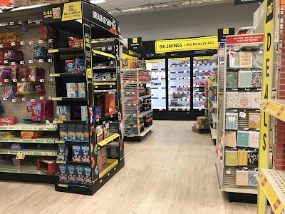
Hello there, and thanks for checking out The Retail Connection! In today's post, we are taking a  short tour of this Dollar General in Millville. It opened in late August 2022 in a former Rite Aid which dates back to 1997 when it opened as Eckerd. The store still has the iconic Eckerd façade, as well as the interior flooring from Rite Aid's "Wellbeing" décor package. This post won't have a lot of commentary from me, as it's kind of difficult to make comments on a store with no departments or special features. Without further adieu, let's start this tour!


Our first shot is a little blurry as we enter the store. I believe those "Welcome" stickers on the doors are left over from Rite Aid. There are "Thank You" ones on the other side, and we'll see those towards the end of the tour.


Food items are immediately to the left when you walk in. The packed snack shelves would make for some good B-roll.


The Dollar Deals aisle is in the back right corner of the store. This is where the general area of the pharmacy was in the Rite Aid days.


Here, you can see the "Thank You" stickers I was talking about earlier.


The oval Eckerd sign has been reused by Dollar General. Although it's impossible to see it in my photo, the "Drive Thru" and "Food Mart" label scars are still visible on the sign below it.

Other Images of Interest

Before Dollar General


I took this photo on July 10 of last year, before Dollar General opened. It looks like they had already started the process of moving in, as the building had been painted brown already. Rite Aid was tan.

Street View Images

2023

Pretty good crowd sometime last month!

2018


This store got the Wellbeing remodel sometime around 2017. The exterior was repainted and a refreshed logo was put up in the oval sign frame. This store did not get the new mortar-and-pestle logo before closing.

2013


Rite Aid is still using the Eckerd color scheme and signage here. At the time, the store had the Rite Aid "Customer World" décor which was put into a lot of ex-Eckerd stores soon after being converted.

That concludes this post on The Retail Connection! Another post is coming tomorrow, so stay tune for that. Thanks for tuning in! Save time, save money, The Retail Connection. 


Sunday, April 23, 2023

Acme | Clayton, NJ


20 S. Delsea Drive

Welcome to the Clayton Acme!

Thanks for checking out The Retail Connection once again! Today, we are at a very special store. While it was a very run-of-the-mill A-frame grocery store when it opened back in 1964, the Clayton Acme is today one of the most iconic stores in the entire chain, for its exterior has been almost completely unaltered and its pitched-roof remains. I'm very honored to be able to bring this store to the blog, so let's not wait any longer and head inside.


Unfortunately, our first photo isn't a very great one, but this was a difficult store to photograph considering its size. However, this is the customer service desk which is located in the front left corner of the store by the entrance.


Here we are looking at the produce section, which is dubbed "Farmstand" in the Premium Fresh & Healthy 3.0 décor. This look is a remnant of the SuperValu days and has been entirely phased out in favor of Quality Built. Clayton was probably one of the last Acme stores to get it.


This is a look down the right wall, with produce and the deli pantry. As you'll see in these photos, this store is pretty cramped to fit everything in.


This is the almost all-glass front wall of the store, with the iconic lava-lamp tiles still visible from the inside. These tiles were installed in every pitched-roof Acme. This location is the only store with these to still operate as an Acme, although there are some other former locations that they remain in.


Here's a look down aisle two, which is all canned foods. 
This store's aisle markers are hung backwards; in most implementations of this look, the flat side is facing the aisle and not the outside.


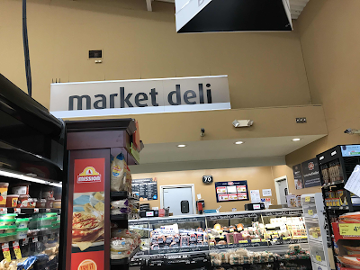
This is the "market deli". Acme stores used to have their delicatessen in the back corner with Corner Deli signage. Unfortunately, the PF&H 3.0 package doesn't use that name, even though this is one of the very few stores that actually has one.


The meat & poultry cases are along the back next to the market deli. This store does not have an in-store bakery, so as you can see there are some Entenmann's products on a display in this area as well.


And looking from the other direction across the back of the store. Here you can see what I mean with the aisle markers. That side should be facing the other direction.


The dairy department is in an alcove along the left wall. This area feels very unnatural, as if it were an addition, but to my understanding there were no expansions made to this store so I assume it was just built like that.


Frozen foods are in aisle seven. In this picture, we also get to see a glimpse of the lava-lamp tiles, the checkout lanes, and the "Thank you for shopping ACME" sign, which looks really cool with the sun shining through it.

Other Images of Interest

Street View Images

2022

This picture was only taken six months ago, so obviously no change.

2011

This picture was only taken 11 1/2 ye--wait a minute. Yeah, there hasn't really been much change to the exterior of this store since it opened, other than the new block letter sign which was probably installed in the early 2000's. I like this shot because you can see an old Acme trailer with the red oval logo in the background. That trailer is still there today, and it's even my Flickr profile picture!

Well, that's all we have today on The Retail Connection. I think this is my favorite store I've photographed for the blog so far. It's incredible how this tiny store has escaped so many rounds of closings over the years. There were a good amount of people shopping here during my visit on a Sunday afternoon, so they must do good business. Acme is also the only supermarket in Clayton, so that certainly helps. Anyway, thanks for stopping by! Sincerely, The Retail Connection.


Memorabilia | Pathmark Decaffeinated Coffee Can

For our first piece of retail memorabilia this month, we're taking a look at this can of Pathmark-brand decaffeinated coffee. I got this...