20 S. Delsea Drive
Welcome to the Clayton ACME!
Thanks for checking out The Retail Connection once again! Today, we are at a very special store. While it was a very run-of-the-mill A-frame grocery store when it opened back in 1964, the Clayton ACME is today one of the most iconic stores in the entire chain, for its exterior has been almost completely unaltered and its pitched-roof remains. I'm very honored to be able to bring this store to the blog, so let's not wait any longer and head inside.
Unfortunately, our first photo isn't a very great one, but this was a difficult store to photograph considering its size. However, this is the customer service desk which is located in the front left corner of the store by the entrance.
Here we are looking at the produce section, which is dubbed "Farmstand" in the Premium Fresh & Healthy 3.0 décor. This look is a remnant of the SuperValu days and has been entirely phased out in favor of Quality Built. Clayton was probably one of the last ACME stores to get it.
Here's a look down aisle two, which is all canned foods. This store's aisle markers are hung backwards; in most implementations of this look, the flat side is facing the aisle and not the outside.
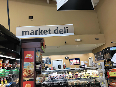
This is the "market deli". ACME stores used to have their delicatessen in the back corner with Corner Deli signage. Unfortunately, the PF&H 3.0 package doesn't use that name, even though this is one of the very few stores that actually has one.
The meat & poultry cases are along the back next to the market deli. This store does not have an in-store bakery, so as you can see there are some Entenmann's products on a display in this area as well.
And looking from the other direction across the back of the store. Here you can see what I mean with the aisle markers. That side should be facing the other direction.
The dairy department is in an alcove along the left wall. This area feels very unnatural, as if it were an addition, but to my understanding there were no expansions made to this store so I assume it was just built like that.
Frozen foods are in aisle seven. In this picture, we also get to see a glimpse of the lava-lamp tiles, the checkout lanes, and the "Thank you for shopping ACME" sign, which looks really cool with the sun shining through it.
Other Images of Interest
Street View Images
2022
This picture was only taken six months ago, so obviously no change.
2011
This picture was only taken 11 1/2 ye--wait a minute. Yeah, there hasn't really been much change to the exterior of this store since it opened, other than the new block letter sign which was probably installed in the early 2000's. I like this shot because you can see an old ACME trailer with the red oval logo in the background. That trailer is still there today, and it's even my Flickr profile picture!
Well, that's all we have today on The Retail Connection. I think this is my favorite store I've photographed for the blog so far. It's incredible how this tiny store has escaped so many rounds of closings over the years. There were a good amount of people shopping here during my visit on a Sunday afternoon, so they must do good business. ACME is also the only supermarket in Clayton, so that certainly helps. Anyway, thanks for stopping by! Sincerely, The Retail Connection.


This store is a classic, and it's great that one of these pitched-roof Acme stores survives into the present virtually untouched. Very cool tour! The mod-Acme tiles inside the store are great too, and it's nice those (along with all the windows and the interior pitched ceiling) remained untouched. I hope this store stays as-is for many more years to come, as it's a great piece of supermarket history and classic mid-century architecture all in one!
ReplyDeleteIt definitely is! I've heard that the tiles provide actual structural support to the store and they can't remove them unless they want to completely redo the store, but I don't know that for certain. I don't know why they'd want to get rid of them anyway, since they aren't hurting anybody and look really cool. I also hope this store remains for a while, and I'm pretty confident that it will considering it's already lasted almost 60 years without any major modifications, and, like I said, is the only grocery store in town so it doesn't have any major competitor! Thanks for commenting!
DeleteGreat tour! I love seeing those ACME tiles intact, and I agree with you that it's also very neat seeing the sunlight shine through the clear "thank you" sign -- the translucence of the department signs is really the only reason I like this PF&H package. It's a shame they ditched the term "corner deli" for that one, though, especially considering that term would work perfectly here!
ReplyDeleteI know Acme Style nicknamed PF&H 3.0 "paint and cardboard", but it's honestly my favorite iteration of that look for the reasons you said. It's very simple, but it looks really nice and it's also easy to change out signage. And it's certainly a shame that they didn't use the corner deli name! I believe the only other store with a true corner deli is the pitched-roof Cape May store, which has the Neighborhood Market décor that calls it "Delicious Deli". Thanks for reading!
Delete